We love 7-day challenges at SnapHabit. Our app is optimized for these short courses. But we also know that simply running your challenge through email can be a fantastic, low-friction way to drive traffic.
Email courses are often used by marketers wishing to establish online businesses due to the fact that it's simple, cheap, and easy-to-control. However, despite these merits, making good and effective email courses takes experience and knowledge. We have recently researched 30+ email courses during the past two weeks and summarized these five details that marketers should be aware of when making their email courses.
#1 Quick and Easy Set-Up
On the internet, people's attention is short-lived. When someone visits your site, his/her attention and interest is only temporary. The passion may quickly die or be distracted by something else. This means that if you want people to register for your course, make it quick and straightforward.
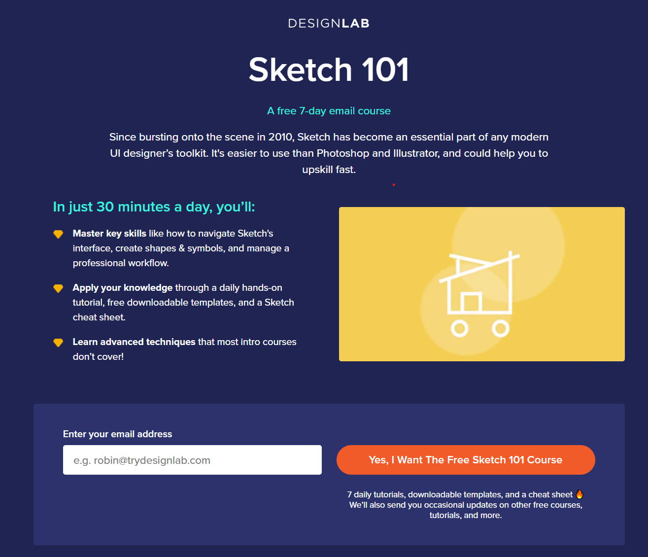
Like the example, you would like to have the registration box obvious on your page and requires minimal information. Another thing people often forget is the first email. DON'T LET THEM WAIT.
Test your site before you launch your course. After registration, the first email should be sent within seconds because that's when people are still interested. Of all the courses that we enrolled ourselves, we have found two courses that made us wait for minutes until sending their first email. To be honest, this may not be their fault since they probably use a third-party email service that handles the automated email sequence.
#2 Be Clear About the Investment and Reward
Although email courses are usually free because they are marketing tools to attract prospect customers, it doesn't mean there is no cost for the customers. Committing to your course involves time investment and other cost; thus, you would have to make the visitors feel that they are getting adequate rewards from their investment.

On your course website, you should be upfront about it, and be clear about it. Let the visitor know from the get-go that they only have to invest a short amount of time every day in learning the knowledge they are interested in.
One of the mistakes we have found many email courses have is that they are too vague about the takeaways. 31% of the email courses we have researched didn't make a clear first impression about what people can learn from the course. These courses use very generic catchphrases like "learn all the secret about trading in 7 days".
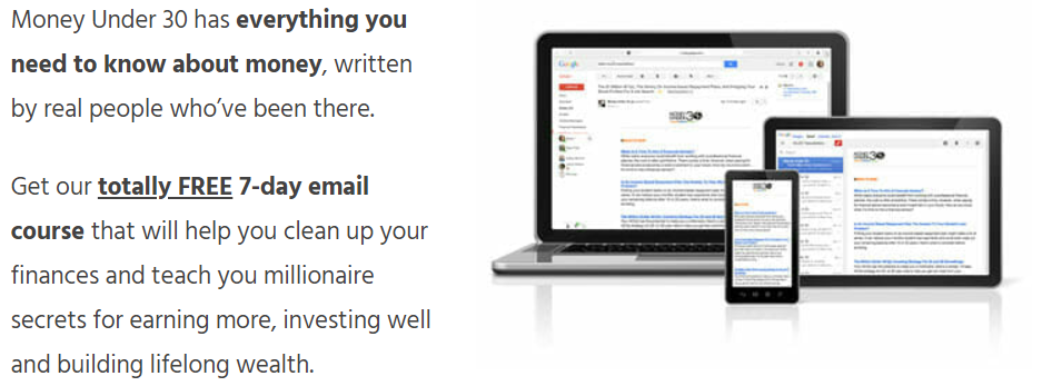
This doesn't help because, first of all, they don't build credibility. Secondly, visitors who come to your website usually don't want to learn everything you teach. Rather, they have a specific need in mind. They would like to see if the course aligns with their interests.
What you should do, instead, is have a shortlist of key things the prospects would be able to know or do after they finish the course as you guided. These specific takeaways attract people to enroll in your course, and they help the prospects set up achievable goals that increase anticipation.
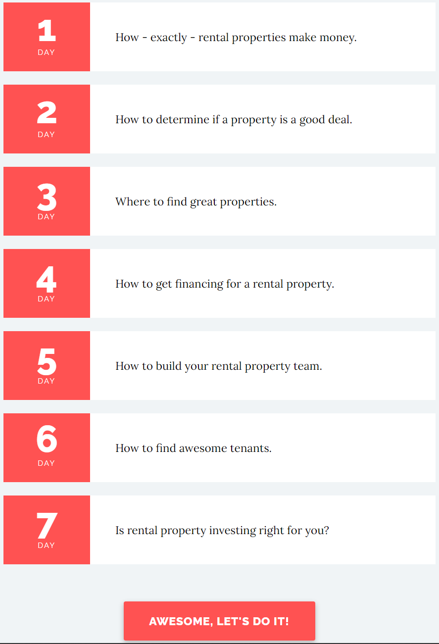
17% of the courses have clear timelines on their website. This is a great way to communicate your course takeaways clearly, plus it will make your course more structured, which we will talk about in the next part.
#3 KISS - Keep It Simple and Structured
In order to give your product/service more exposure, you would like to have the prospect keep interested and learning your course. This means that your course content has to intriguing. Two basic rules here are making the knowledge simple and the content structured. This is to make it easier to learn and build a logical flow so that your prospects are more likely to continue as you guided.
From our research, all email courses limit their content to 10 to 30 minutes daily reads, while most limit to less than 15 minutes. You should design your daily content within the same length range. Not only should your content be short, but they should also appear to be short as well. So, it would be best if you always avoided long text since it makes your course a lot more challenging than it really is.
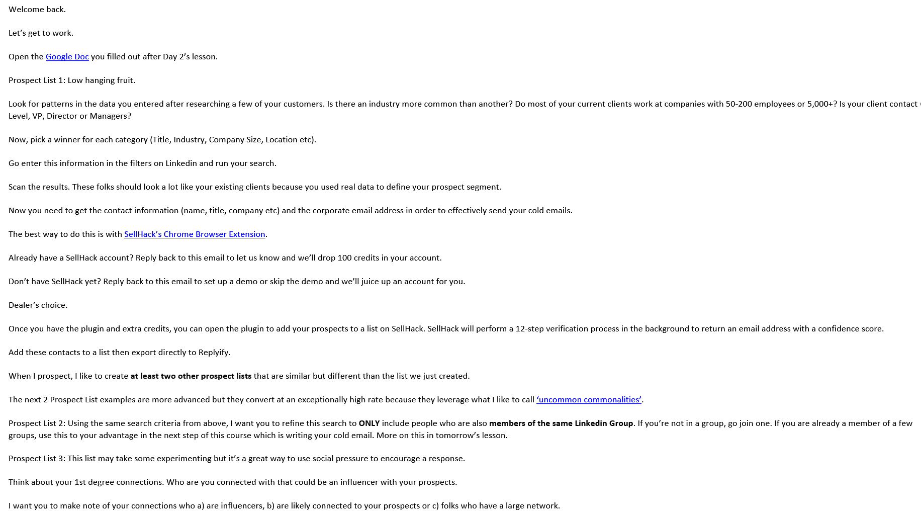
We have found three simple and useful designs that you can easily learn and adopt in your email course:
1. Simple Bullet Points
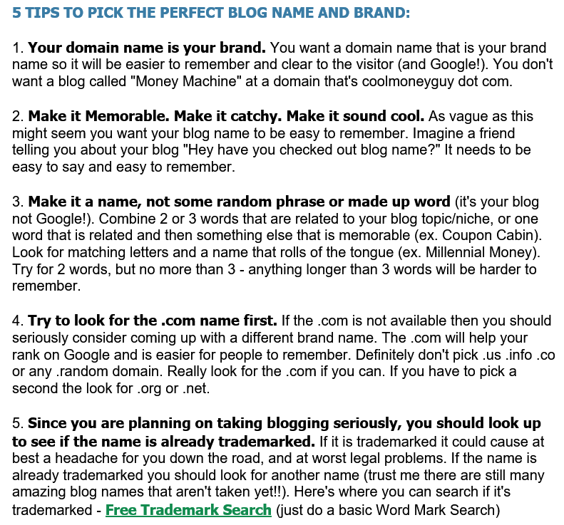
2. Text Blocks
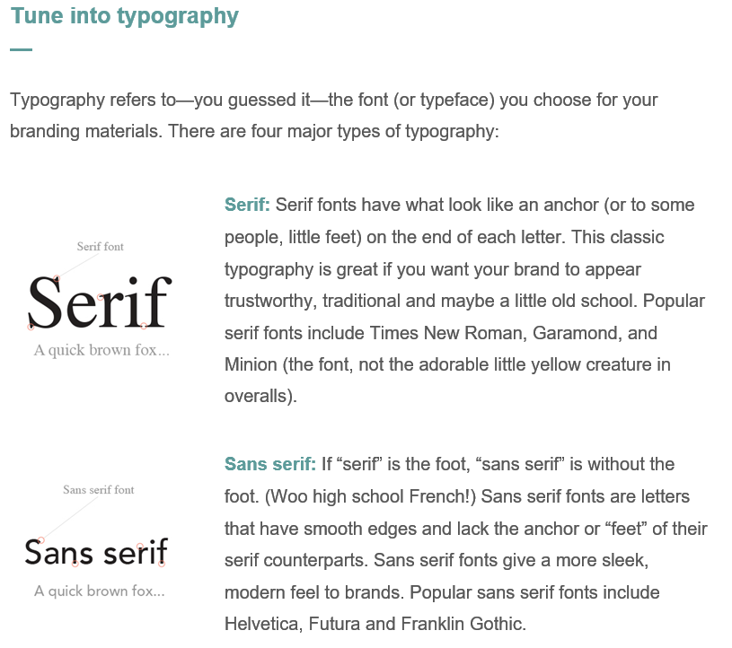
3. Visual Aids
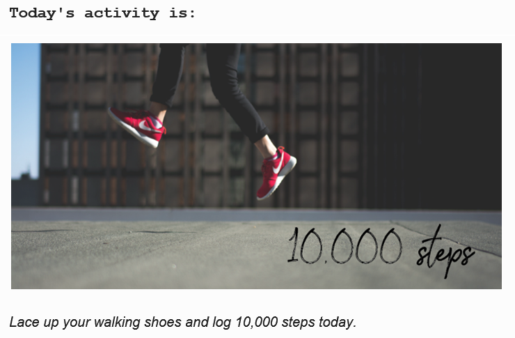
Using these simple tools to design your email course, you would already be outstanding among others. We have found out that 55% of email courses use long text with no or barely any editing, and 79% use no visual aids.
For more advanced designers or editors, you can make your own instruction visual aids like infographics, gifs, and videos. However, this is not an easy task as it seems to be. In reality, people use different email services, so your cleverly designed emails might not appear as you wanted when your prospect opens them.
#4 Don't Forget to Sell
In the first three points, we have mainly talked about making your customers intrigued by your content. BUT, your goal is not to provide them with free education (although that would be a great mission). You are here to sell. Throughout your course, you should intermittently embed your promotional messages within your content. This is the tricky part. You can make it obvious that you are advertising your product/service or making it subtle.
This is the crucial part of your email course, transforming the prospects into actual customers. Here, the safe bet is to use the simple discount strategy, but you probably are more creative than that.

After studying the email courses, we would like to share the common methods that other email marketers have used to incorporate marketing messages in their email courses. You may borrow their ideas to make yours.
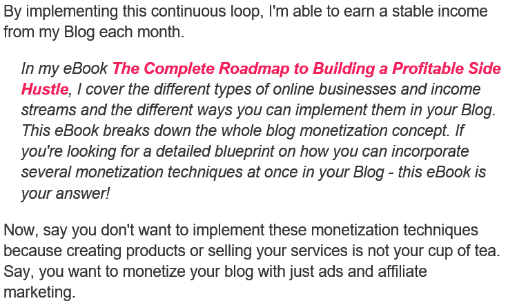
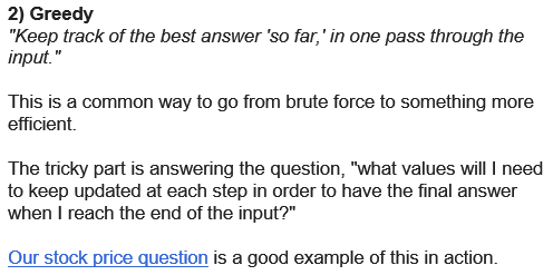
1. In-text Mentions
Simply mentioning your product/service when covering related issues.
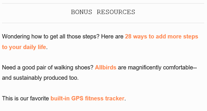
2. Bonus Content
Advertise your product/service as extra resources for the prospects.
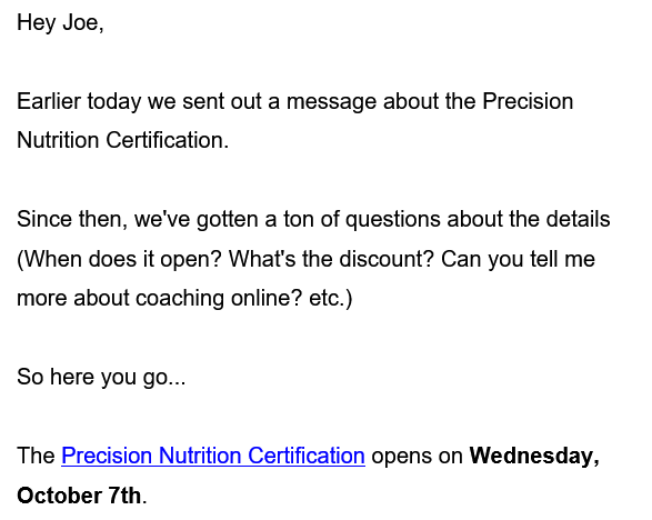
3. Direct Emails
Send direct sales/marketing emails to your prospects selling your products/services.
#5 Stay Away From Spam Box
The trash box probably is the most heinous villain for email marketers. To have an effective email course, you most certainly want to avoid being put into spam box. This might be a little more technical than branding and messaging. There are some ways to help you keep away from the spam box.
Use a trusted email service provider
Many email service providers highly associated with marketing emails are usually blacklisted by commonly used email services like Gmail, Outlook, and Yahoo. You may want to test if your email service is blocked.
Use more humanly email address
When sending emails, don't use some email address like [email protected] or [email protected]. Emails from these addresses are more likely to end up in spam.
Careful wording and visual-editing
Build your email like you are actually writing them. There are many email templates and automation services, but you should always make your content unique and special.
There are a lot more things you can do to keep your emails out of spam. If you'd like to learn more, you can find a lot of resources on the internet.
Conclusion
Thank you for reading! These five bits of advice will help you build better email courses. But, you should also know that building an email course is not a one-off effort. You need to spend time maintaining it too. Learn from your feedback and data, study your customer groups, and revise your content. With these efforts, you will see a steady stream of new customers.

